Component "Sub Navigation" has no content
4 Packaging Concepts We Have Loved The Most
Packaging that takes advantage of a product’s concept and branding as a unique way of customising packaging has been on the rise. Personalised packaging instantly stands out from all the standard product packaging on shelves, propelling it into a luxury market of its own.
1. Creative Die-Cut Packaging

The die-cut section on this spirits packaging below is an outline of the Province of Abruzzo in South East Italy. The roots of Sette Vie originate from a family of master distillers from Abruzzo who have been perfecting their craft since the 1800’s. Sette Vie is therefore steeped in the history and landscape of the region, which makes the die-cut feature on their product packaging the perfect way to represent their brand whilst also displaying the beverage within.
2. Fun Packaging
Packaging that really stands out as being creative and fun is when the consumer’s experience has been given extra care and thought. A recent project for Adnams saw us design and manufacture a die-cut packaging solution for their 3x 2cl Gindulgence gift packaging.

This bright and cheerful lithographic printed packaging is complete with a matt laminate coating to give it an extra premium look and feel. If you look closely below you can see it even includes a helpful cocktail recipe suggestion for the ‘red snapper’!
3. Clear & Bold Packaging
Consumers these days don’t have the time to read every inch of text and information on a product’s packaging before purchasing. This means their eyes are often pulled towards packaging that does the work for them; packaging that is clear and to the point.

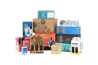
The Five Points Brewing Co beer packaging does this extremely well. Kate Lyons was the graphic artist behind The Five Points’ visual branding and the striking visual design of the boxes.
“Kate Lyons has created a clean and classic look that still manages to be bold and eye-catching, yet also contain all the key information such as amount of bottles, size of bottles, alcohol by volume and so forth.” Doreen Joy Barber, Communication, Events & Marketing Manager, The Five Points Brewing Company.
4. Luxurious Packaging
Maldon Salt saw us design and manufacture packaging for their Salt Pig. It includes a one-colour lithographic print on the outside AND the inside, which adds an additional element of fun and surprise when opening.

Black and white are a luxurious combination when applied to product branding and packaging, and Maldon Salt’s packaging utilises the high contrast extremely well with a spot UV varnish used on the outside of the box.
If you are looking for a bespoke, stand out packaging solution. Get in touch on 01502 513112 or email info@saxonpackaging.co.uk.


